Case Study · LendingClub · 2018

Redesigning LendingClub's
Member Experience

Role End to End Product Design Lead
Team Product Manager, Engineering Lead, 6 Engineers
My Work UX Research, Interaction Design, Prototyping & Testing, Visual & Motion Design, Handoff & QA
Impact 30% lift in loans to existing customers · LendingClub's first $1B quarter
Redesigning LendingClub's Member Experience

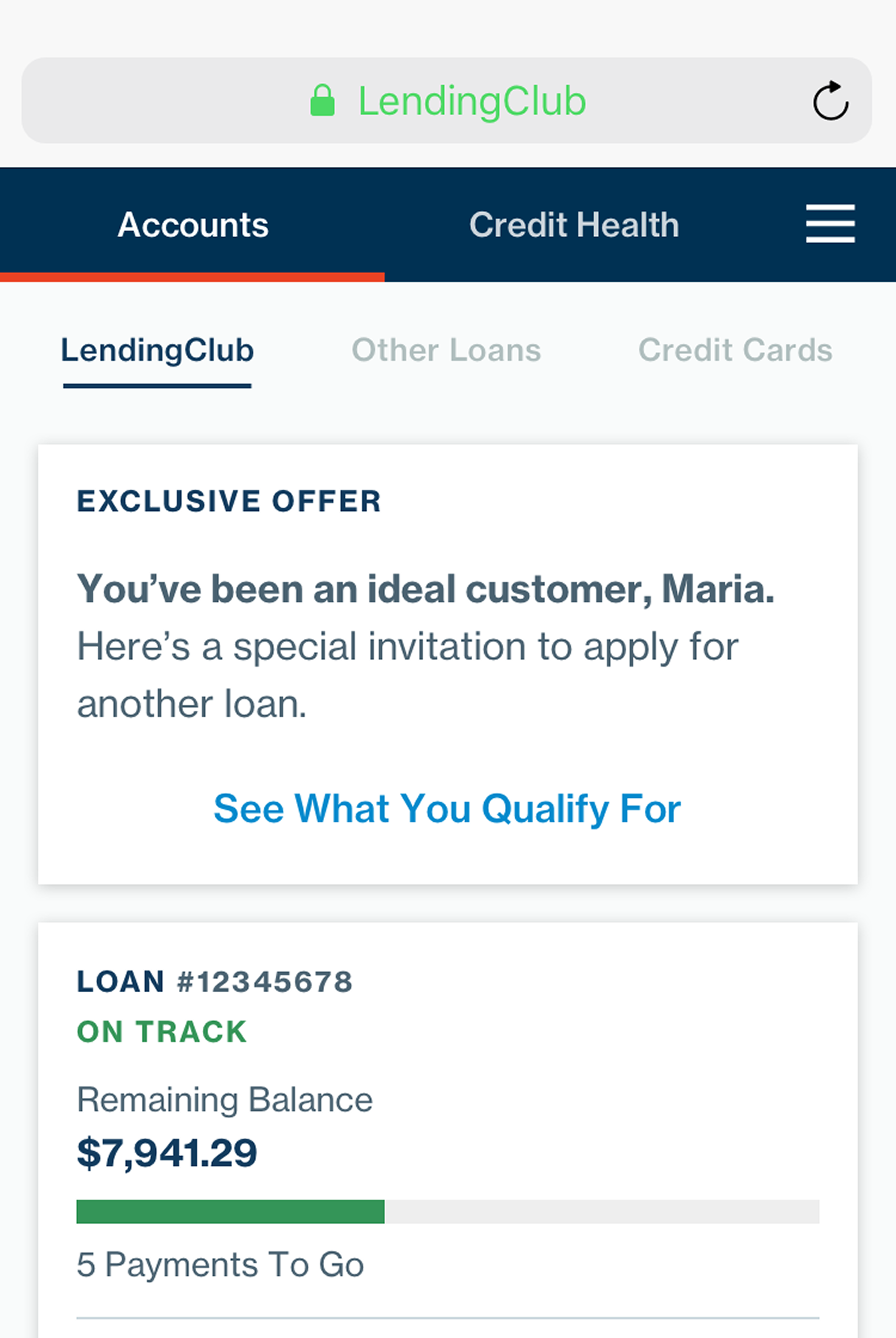
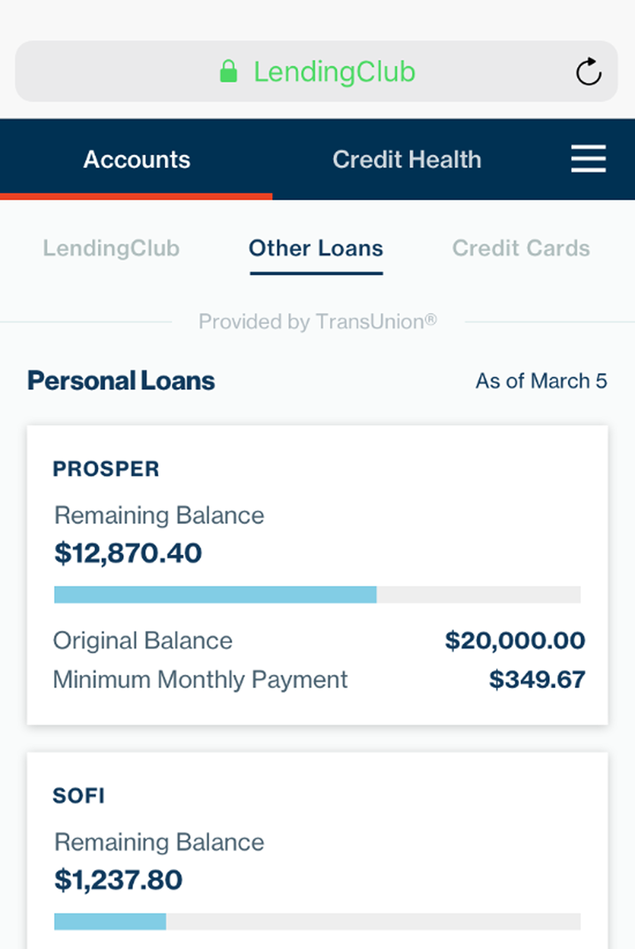
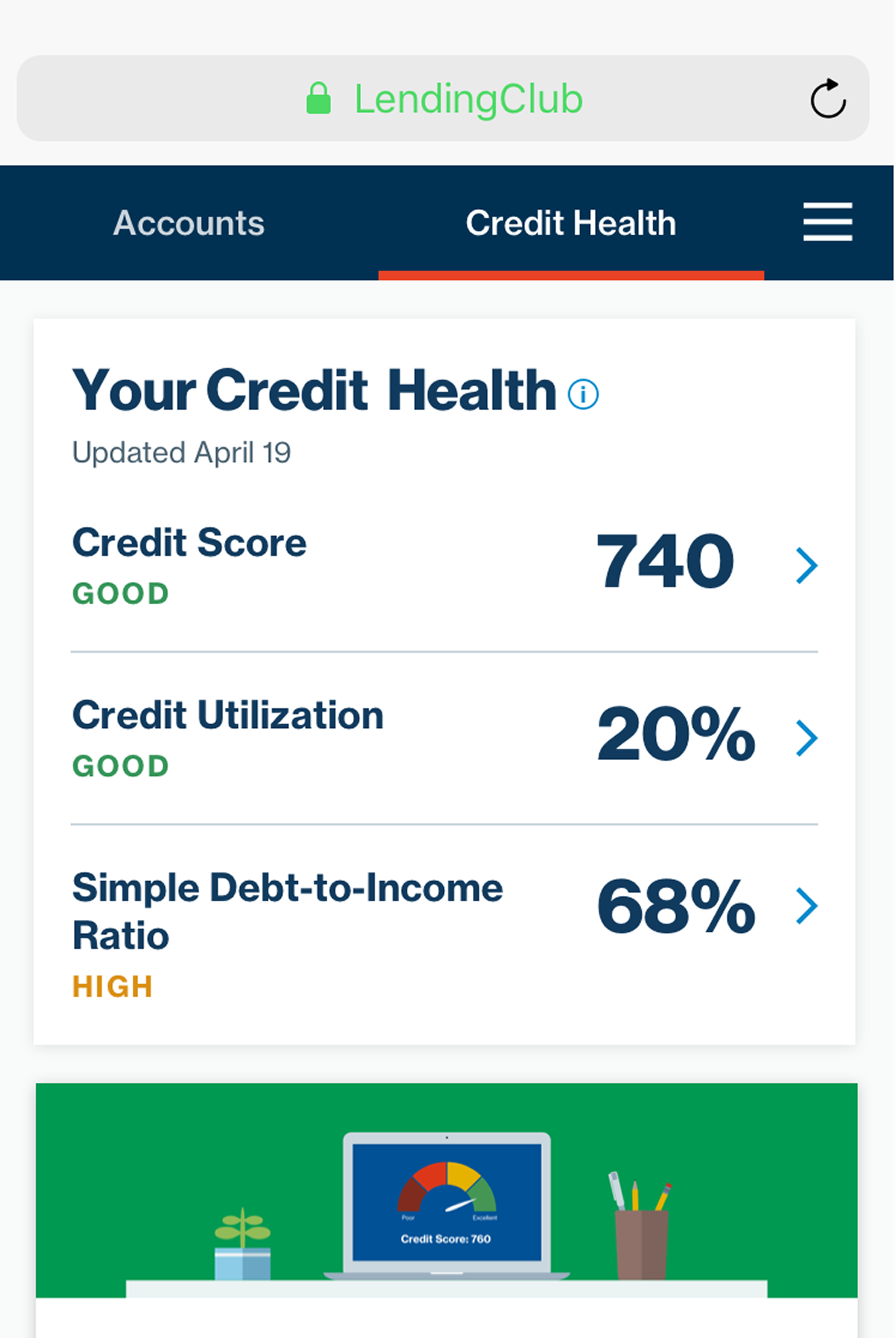
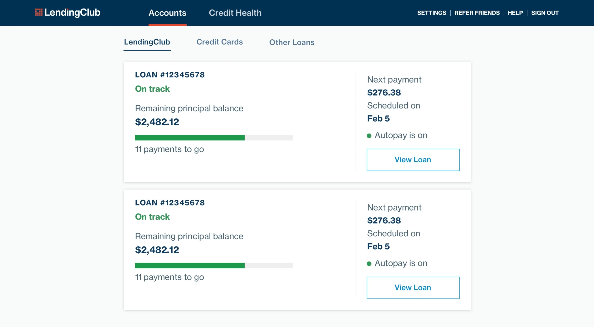
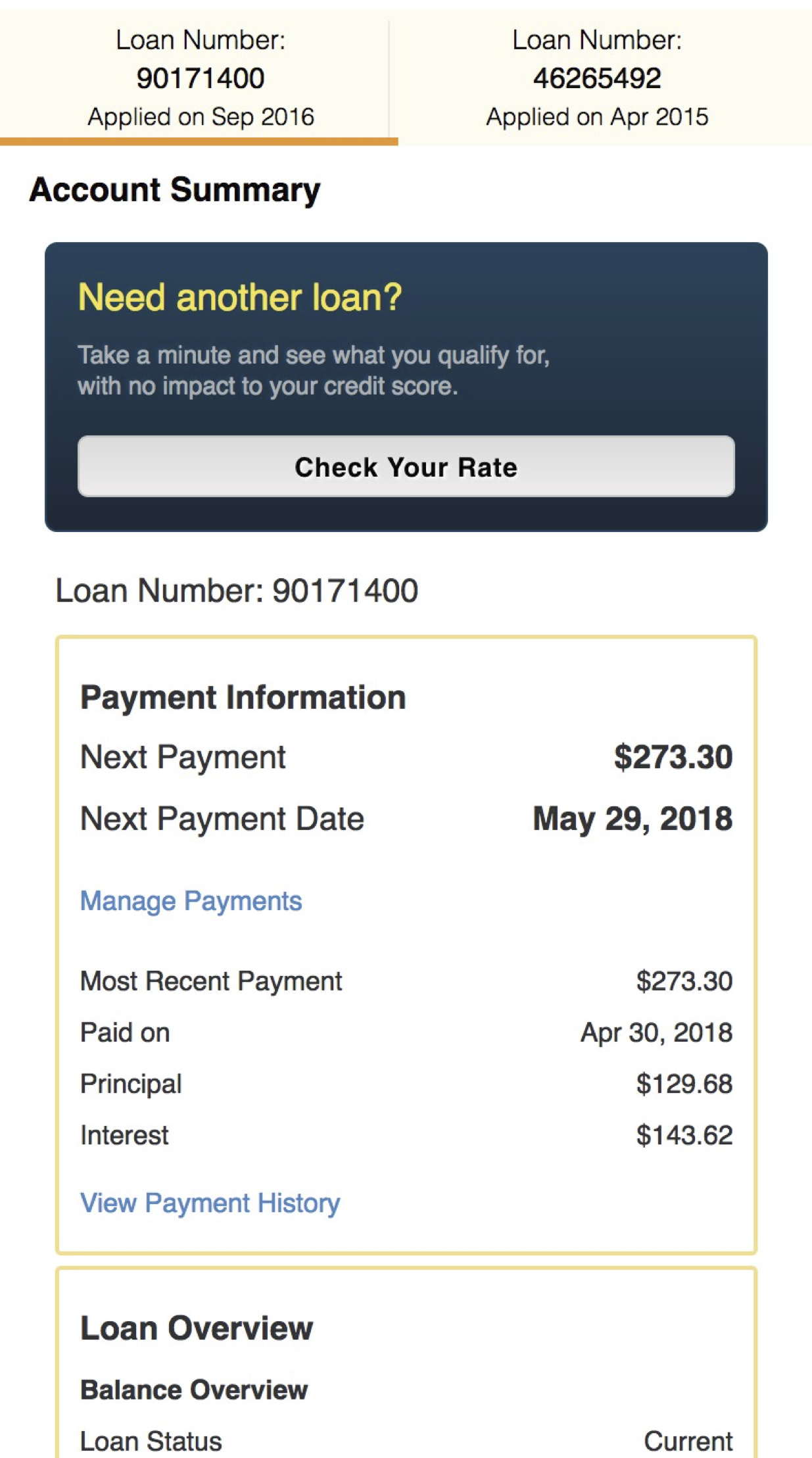
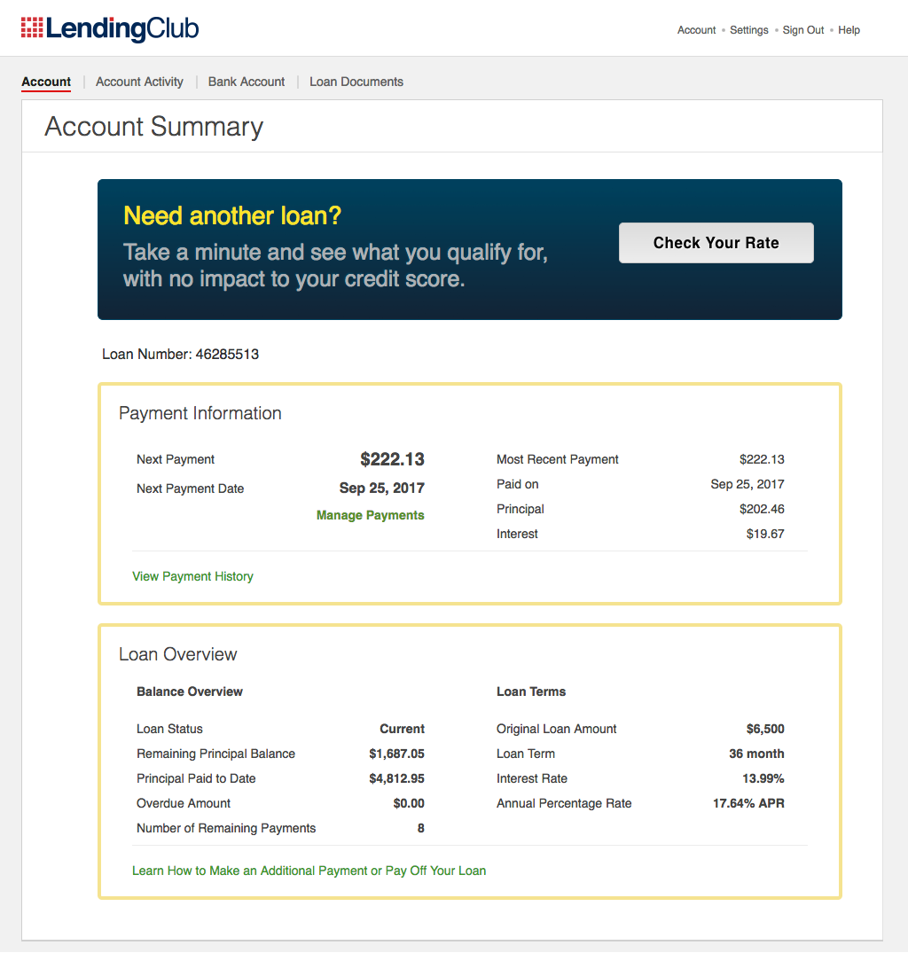
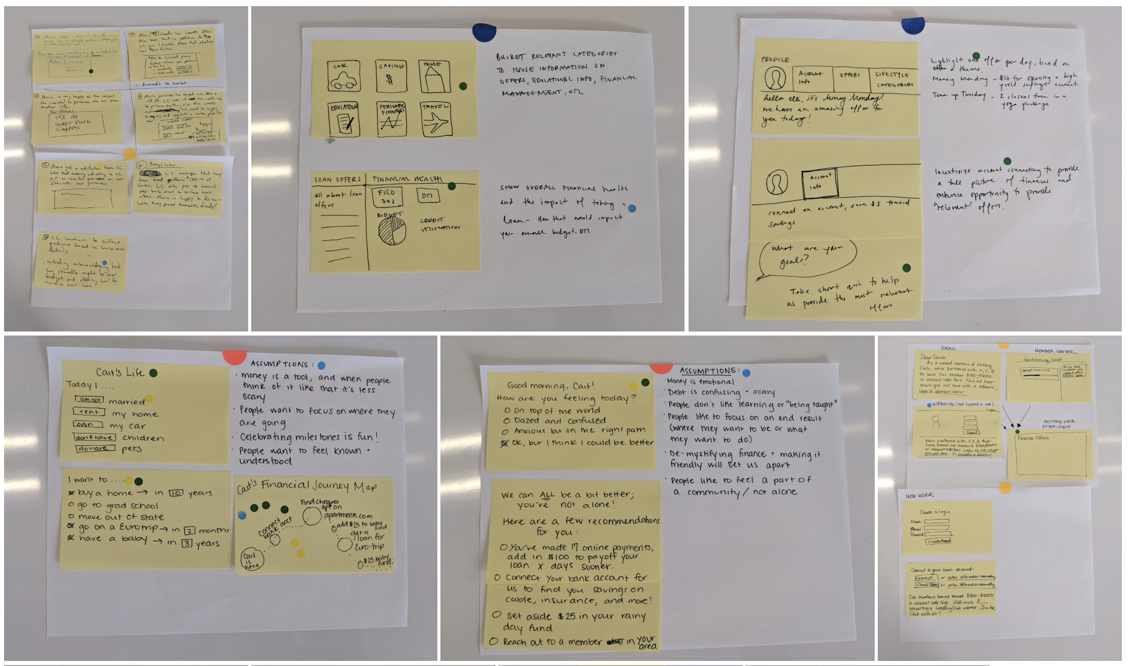
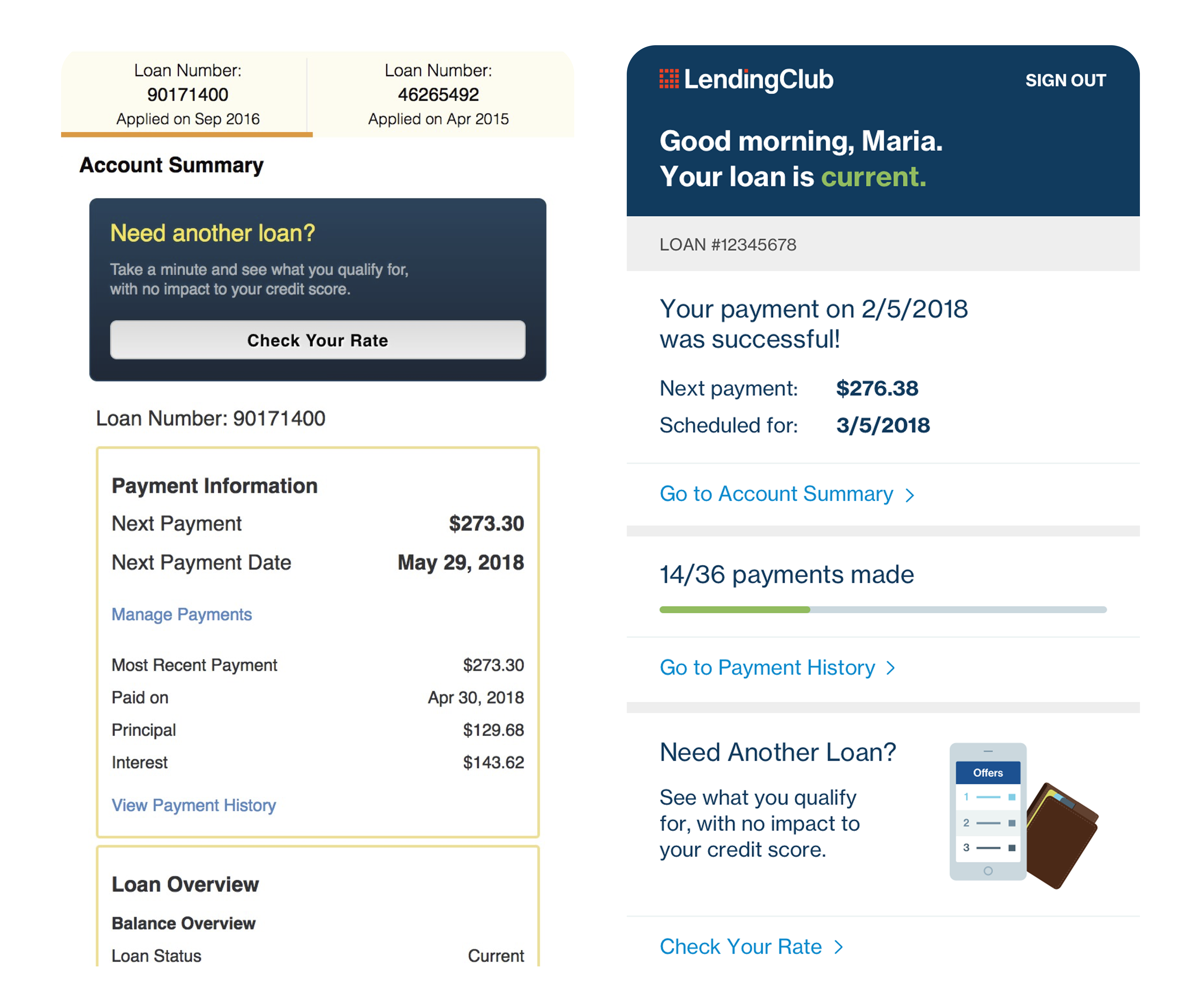
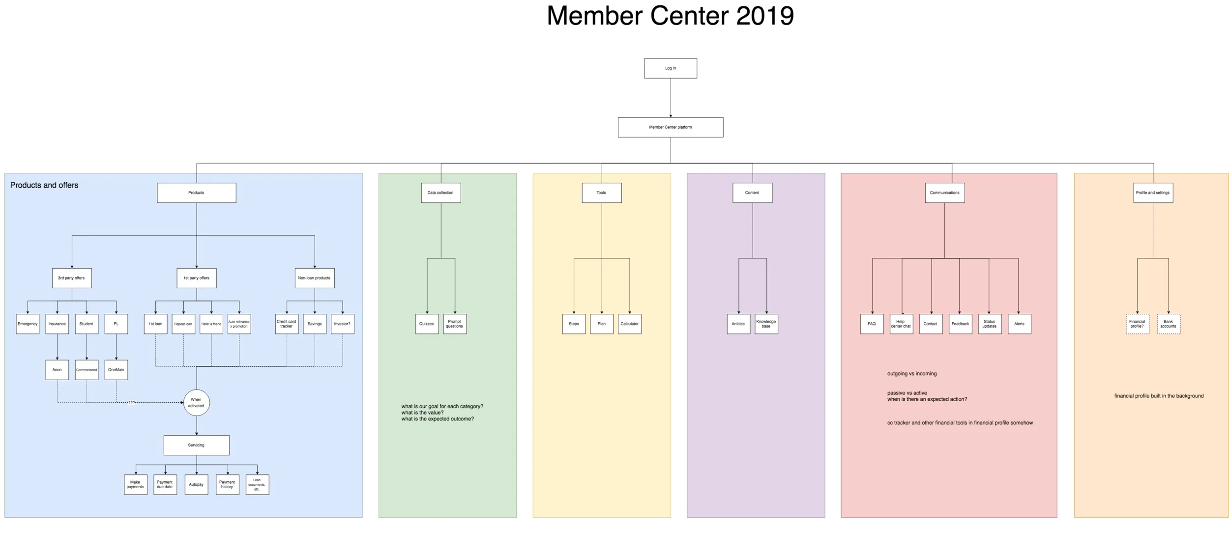
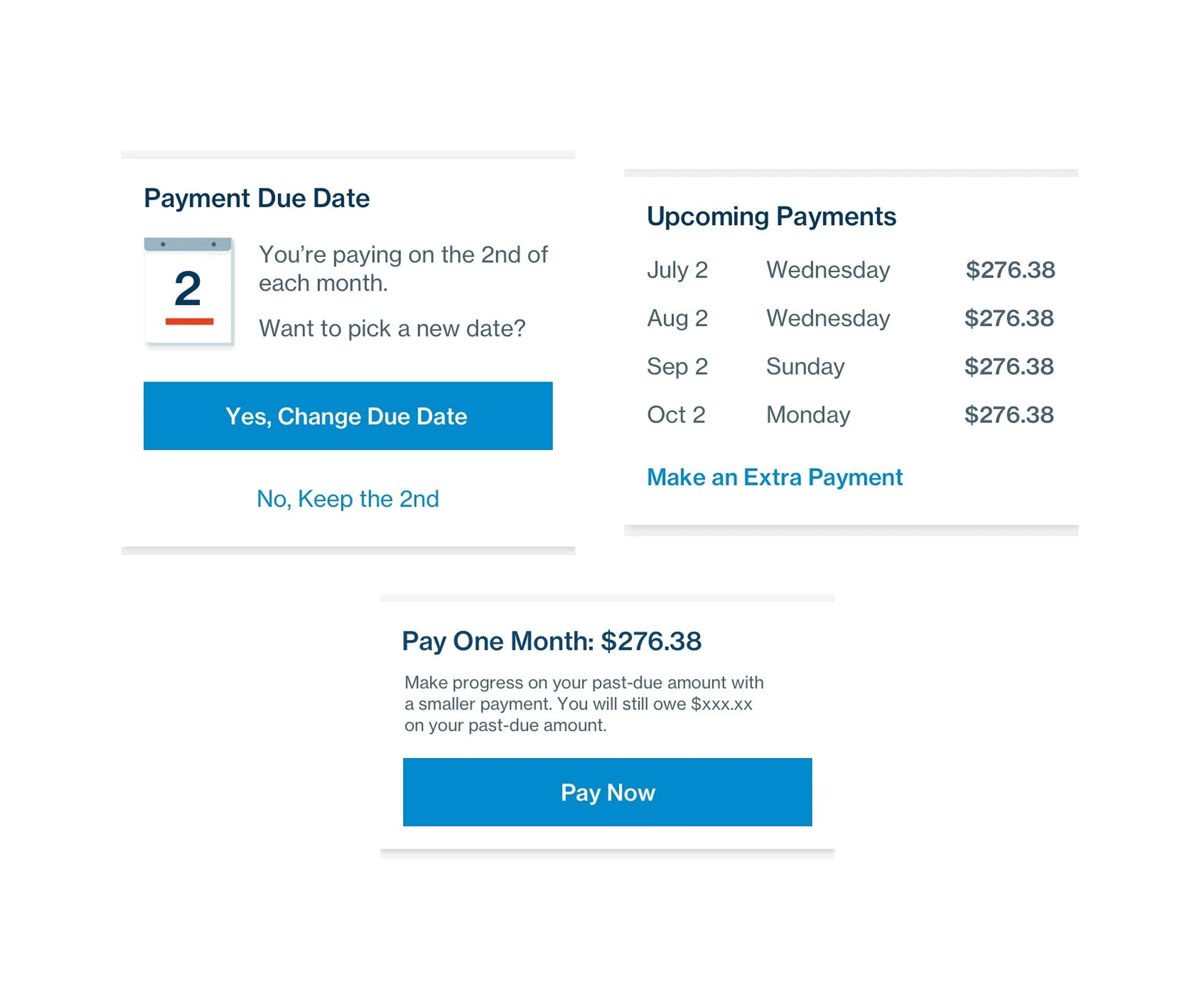
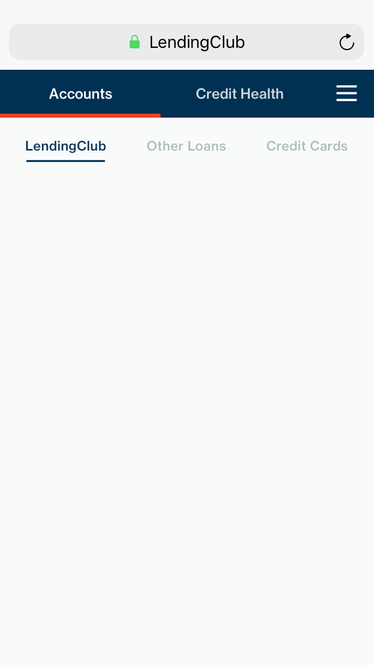
A next-generation membership experience

I defined, validated, and shipped a next-generation membership experience for LendingClub's 5 million active customers. While I'm proud of the measurable impact this project had on business metrics — a 30% lift in loans issued to existing customers, and LendingClub's first $1B quarter for these types of loans — I'm especially proud of the impact this work had in informing and enabling a customer-focused strategy for LendingClub for 2019 and beyond.

Member Center 1 Member Center 2 Member Center 3
Member Center Desktop

A platform built for transactions, not members

LendingClub is a peer to peer lending marketplace that connects borrowers with investors. They are the market leader in personal loans, having issued more than $15 billion in loans since 2018.

To get to where the company was, acquisition and growth were historically the primary focus of the product team's efforts. The result was a transactional and impersonal post-issuance experience with limited value to users. This created a huge experience and business opportunity: build lasting relationships with customers and treat them less like visitors and more like real members.

Account Summary Mobile, 2017 Account Summary Desktop, 2017
Before and after designs

Establishing a baseline

Because this was a true redesign project, it was necessary to establish a baseline understanding of the experience as it existed. I led user testing sessions to identify opportunities and gaps, combining qualitative data with competitive analysis to inform cross-functional brainstorms and workshops with clear goals.

UX Goals

  • Simplify loan servicing and payment flows
  • Make it easy to access applications, completed loans, and documents
  • Reduce confusion around late payments and fees
  • Empower members to continue on the right financial path

Business Goals

  • Increase loan volume from existing members
  • Maintain critical loan servicing and collections metrics
  • Build a scalable platform to support new products and experimentation
Cross-Functional Workshop Sketches
Sketches and notes from a cross-functional workshop

A practical north star, built toward incrementally

The workshops provided the inspiration and fuel for ideation. Sketching design ideas allowed me to quickly communicate concepts to stakeholders and get directional feedback early.

Many of the concepts reflected significant hurdles in technical capabilities. Since getting stakeholders excited is meaningless if the design isn't feasible to build, I took a practical north star approach: start with the "in a perfect world" design and value prop, then thoughtfully and incrementally build toward it.

Our value prop was a broad yet simple echo of our UX goals — empower members to continue on the right path financially after they take their first loan.

Sketches — Ideation Phase
Wireframe Concepts
Selection of sketches and wireframe concepts from ideation

Validating a leap of faith with a key test

Before fully committing to the new direction, we needed to validate our assumptions about the structure of the experience and its impact on key metrics. Specifically, we needed to show that the new design didn't negatively impact loan performance.

We A/B tested a stripped-down version of the design — one our engineers could build in a single sprint — against the control experience. The hypothesis was that improving navigation, visual hierarchy, and surfacing oft-requested payment information would lift loan applications.

In reality, we saw a 15% lift in new loan applications. This success gave us the validation to continue building toward the north star.

15% lift in new loan applications — our success metric.

A/B test results validating the new design direction
A/B Experiment — Design vs. Control

A modular, scalable foundation

By collaborating closely with engineering, we shipped incremental updates sprint by sprint to what was now gaining recognition internally as the new "Member Center" — a far cry from the transactional post-issuance experience I had inherited.

By cutting updates into customer segments, we eventually routed all LendingClub customers to the new Member Center, building in improvements along the way to make payments easier, support customization, and other quality-of-life improvements.

By designing the experience as a modular, scalable platform rather than a static account page, we enabled the plug-and-play testing required to learn fast and innovate.

Modular Platform Architecture
Smart Cards
Smart cards surfaced based on loan status

LendingClub's first $1B quarter

Thanks to the streamlined user experience, experimentation capability, and flexibility of the new platform, loans issued to existing customers crossed $1 billion in a single quarter for the first time in LendingClub's history — representing 30% growth year over year.

30% YOY lift in loans issued to existing customers
$1B First $1B quarter for existing-member loans in LendingClub's history
15% Lift in new loan applications from the initial A/B validation test

Building on the platform

We released LendingClub's first set of financial health tools and trackers onto the platform, and continued to validate new features and additions to the experience.

We also worked closely with other product teams to integrate new cross-product experiences, enabling other business units to take advantage of the new platform's capabilities.

Financial Health Tools

The most satisfying part of this project wasn't the business metrics — it was proving that a customer-focused strategy and strong business results aren't at odds. They reinforce each other.

← All Work Next Project Launching Chime's MyPay Feature →